Summer SetUp: Graphics & Imagery
PRO Expo Exhibits is proud to introduce our new ‘Summer SetUp’ series!
While enjoying the warmer air and outside events, the fall season is just around the bend -marking a key time for all trade show professionals to strategize.
The world is consumed with images, with the average person exposed to over 700 marketing messages per day! With so many fighting for attention, the role graphics play on exhibit designs is crucial to achieving trade show success.
Make A Splash
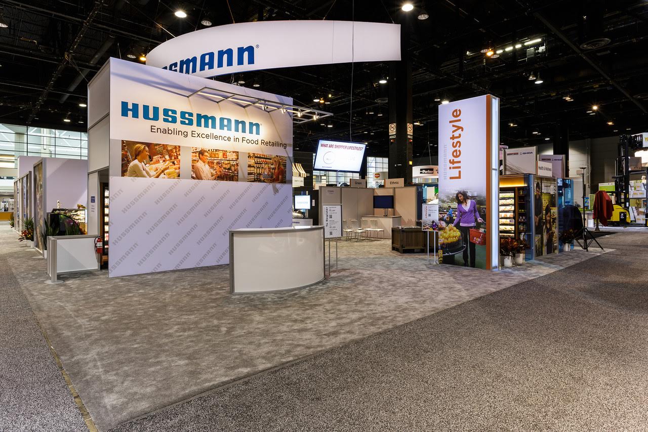
Graphics are without a doubt pivotal in the trade show industry. They will be the FIRST element attendees notice upon waking in, and will serve as the connection between your company’s attitude and capabilities. The choices are endless from high quality imagery to colorful graphics, each type carefully showcases your mission statement for better or worse. As mentioned last week feminine and bright colors are one of the hottest trends for 2015 exhibits. Don’t be afraid to showcase flair! None of your leads will appreciate the world in black and white.
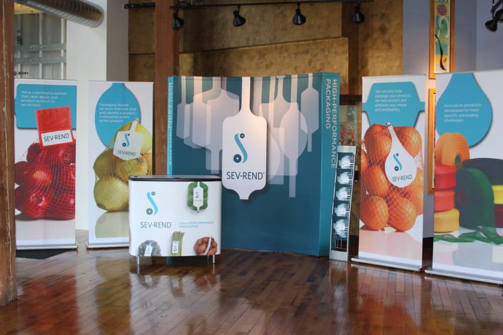
There are numerous way’s to name and describe graphics. Here are a few of the most commonly used types:
- Headers– Basic graphic showcasing your name, logo, and a brief marketing statement. Think of it as a giant business card that cannot be tossed aside. Header’s make a stark impact with the use of a powerful clean design.
- Copy Panels– These offer greater detail after your overall color scheme and header drew them in. More text can be used with imagery, but remember to keep it short, concise, and attention-grabbing. For future reference always make sure to leave a high contrast of colors between your text and background, if great thought is required to make sense of words people will move on.
- Photos– In many cases, you will want your booth staff to do the talking. Leave the words off your panels and go for stark and dramatic imagery that captivates emotion and attention. Lighting can be a great way to supplement this method as well!
Mediums:
Images and graphics can be made in nearly any-way imaginable. From traditional printing to digital design, the power of imagery is limited to your imagination. Today, one of the most simplest methods is scanning drawn images into a computer or designing them from scratch. The usage of digital allows you unprecedented options, but remember to always back-up your files and note every color choice! PRO Expo suggest’s utilizing Adobe Illustrator or Photoshop for most graphic designs while staying away from Microsoft Office, Paint, and CorelDraw.
In addition, when using digital creation always remember these quick tips:
- The best file size per pixels is always 100% at 150dpi
- NEVER Res-Up images, find an alternative image
- NEVER Embed images, or keep them ‘flat’ in design programs. Retain your layers!
- Rasterize ALL fonts before finalizing to avoid size changes. This should be done BEFORE artwork submissions.
The most used graphic mediums today are fabrics. These materials allow for durable and long lasting graphic work while remaining lightweight and portable to reduce your shipping and assembly costs. In addition, fabric graphics are easily changeable and allow you to customize per show. Vinyl graphics are now considered outdated due to their one-time use and amount of glare they provide in a smartphone world. Unless you need a one-shot image for outdoor purposes skip the vinyl and head straight to fabric, your budget and eyes will thank you.
Having created a series of excellent designs through various mediums gives way to the final step, figuring out how to properly display these beautiful pieces! Graphic mounting can be a daunting task, but each type brings different benefits:
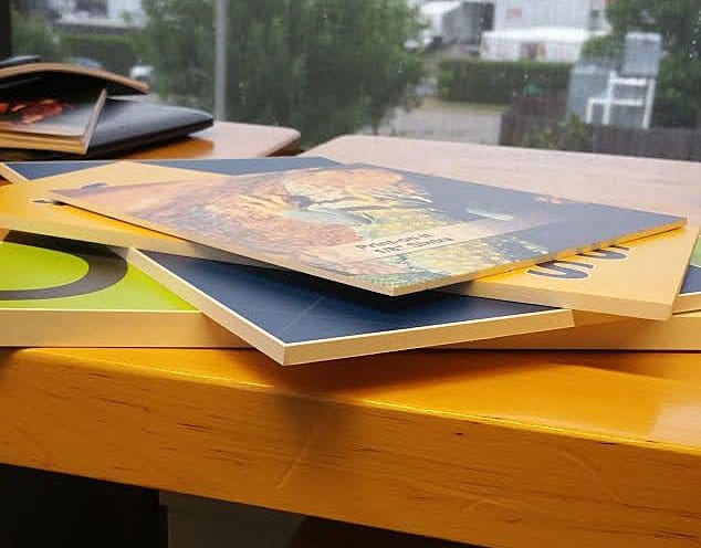
1. Sintra- A PVC material that stays flat, will not easily dent, opaque, and provides the ideal surface or laminate or vinyl graphics.
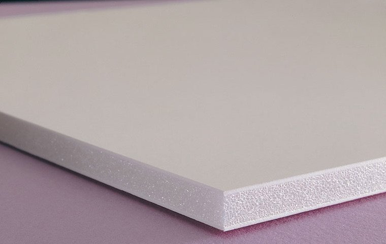
2. Ultra Board/Foam- High density foam boards with hard facing polystyrene plastic. These are great for multi-dimensional graphics and add a sense of extra depth.
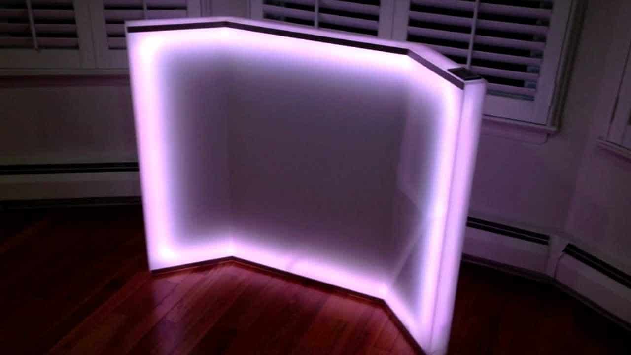
3. Plexiglass- Allows light to pass through giving transparency and shine.
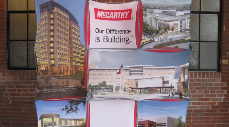
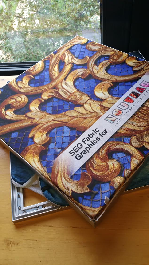
4. Fabric Graphics- These can be used with a variety of products such as SEG (Silicone Edged Graphic) and bannerstands to present clean and crisp looks that are easily changeable.
Understanding graphic basics now will save headaches later! It’s important to note while creativity is encouraged for exhibit booths, you never want to create something overly busy. Keep it clean, simple, and attractive to capture every lead’s attention.
Want More?
- Never get stuck on a term with this Graphic Dictionary (Via Classic)
- Print and Digital Q&A
- Graphic Content Quiz!
WEBSITE T.E.A.M. ‘LIKE US’ ‘FOLLOW US‘


