2017 TRENDS – Color
We have just turned the page on 2017. So what is on the horizon in the trade show industry? PRO Expo has spent some time looking at the predicted trends in color, graphics, social media and the trade show industry as a whole. Over the next 8 weeks we are going to reveal our findings. Below is our first topic for review.
2017 Color
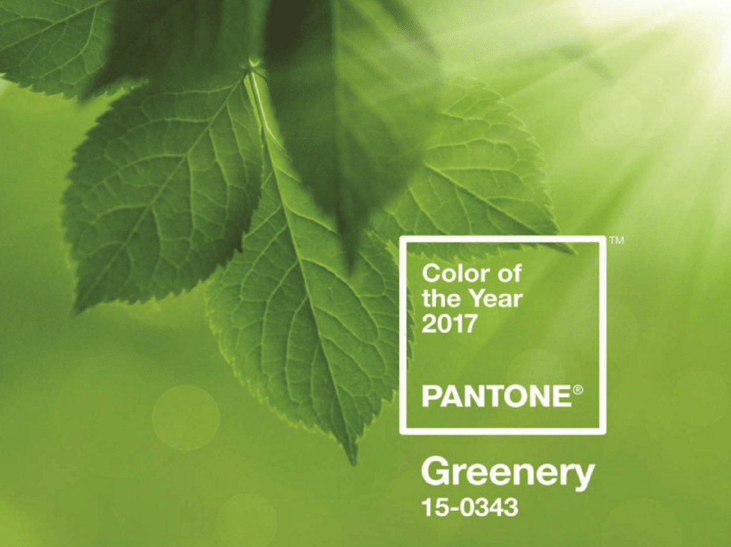
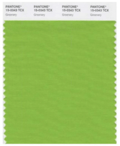
The Pantone Color Institute has named “PANTONE 15-0343 Greenery” its 2017 color of the year. Pantone does not chose its’ colors randomly and this one is no exception to that rule. Greenery is a refreshing take on green and it symbolizes new beginnings.
The Pantone Color Institute describes it as this…
“A fresh and zesty yellow-green shade signaling the first sign of spring, PANTONE 15-0343 Greenery conveys our growing design to rejuvenate and revitalize. Bursting forth in 2017 to provide us with the reassurance we yearn for amid a complex social and political environment, PANTONE Greenery symbolizes the re-connection we seek with nature, one another and a larger purpose.”
What does that mean for us? Expect to see PANTONE Greenery to be used more throughout the year, from as an accent to an entire statement piece. From fashion, to products, to graphics, to architecture this color will make an appearance and an impression in 2017.
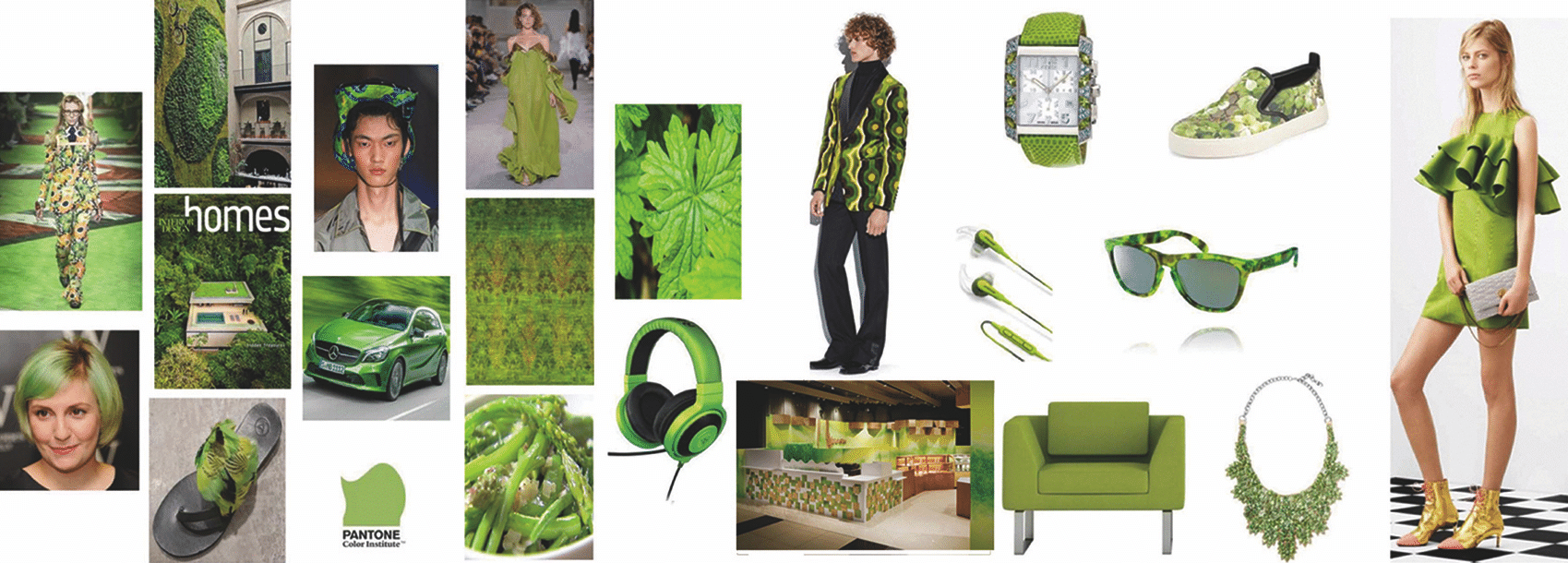
Information taken from PANTONE Color of the Year 2017 webinar & website . View more information on 2017 Color of the year.
![]()

![]()
![]()
![]()