Artwork Tips for Graphics on Your Next Trade Show Exhibit
Designing large-format graphics are not that different from other graphics, but there are a few guidelines to follow and some tips that could help you along your way.
What program do I design with?
 Back up slowly and walk away from the InDesign! Large format graphics need a large artboard. It’s always best to design your graphics at full size whenever possible. So, for that reason, stick with either Illustrator or Photoshop. These two programs are going to give you the right tools for the job! Save InDesign for your next magazine layout.
Designing Graphics
 When designing graphics, simple tends to be most effective. That doesn’t mean your graphics need to look bland though, rather we mean you should cut out overly wordy text and hard to read fonts. Trade show attendees do not want to squint their eyes trying to read novel length text about your company on your graphics. Your sales force is there to explain the ins and outs of your services and/or products. The graphics are a gateway to your sales, by providing insightful and question provoking designs. A few meaningful, catchy, easy to read words and smart images can accomplish this.
Resolution
Resolution is extremely important. You might have designed the most eye catching of graphics, but if it’s not designed at the correct size and resolution all potential prospects are going to see is a blurry, pixelated mess. Make sure your artwork is set up at 100-150dpi (dots per square inch) at full size, then view that art at 100% to make sure there are no hidden flaws or pixelation. That is one of the reasons working in full size is so helpful – you don’t have to double or triple your percent to make sure you’re viewing it as it will look before it prints.
Vector files are great to use since they ensure no loss of quality when making those large format graphics. You will always get a crisp, clean edge no matter how large it is.
If you are adding photos to your design, it is just as important that they are presented at the correct resolution. When buying a stock photo, make sure you are always purchasing the largest option available and don’t forget to check how large it will go before you take the plunge on your purchase.
This is done very simply. To convert a stock photo to 75DPI, multiply the width and height by four. This will give you the maximum size that the image can blow up to before losing any of its original quality.
Layer, Layer, Layer….
Do not flatten your artwork. Doing so, makes it so much harder to fix issues, create a bleed after the design and near impossible to do color matching.
Pantone Callouts
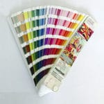 Use Pantone colors whenever possible, particularly when you are needing to guarantee a match. Don’t forget to call them out in your artwork. Using CMYK or RGB mixes will never guarantee an accurate match since each printer is different. PMS is a universal color system that will give you just the right match!
Remember in the trade show world you only have a few seconds to make an impression. By following these simple tips you can make sure those graphics are making a positive one!
Article Written by Krista Kaegbein, Creative Director at PRO Expo Exhibits

